New visual identity and website for the content strategists
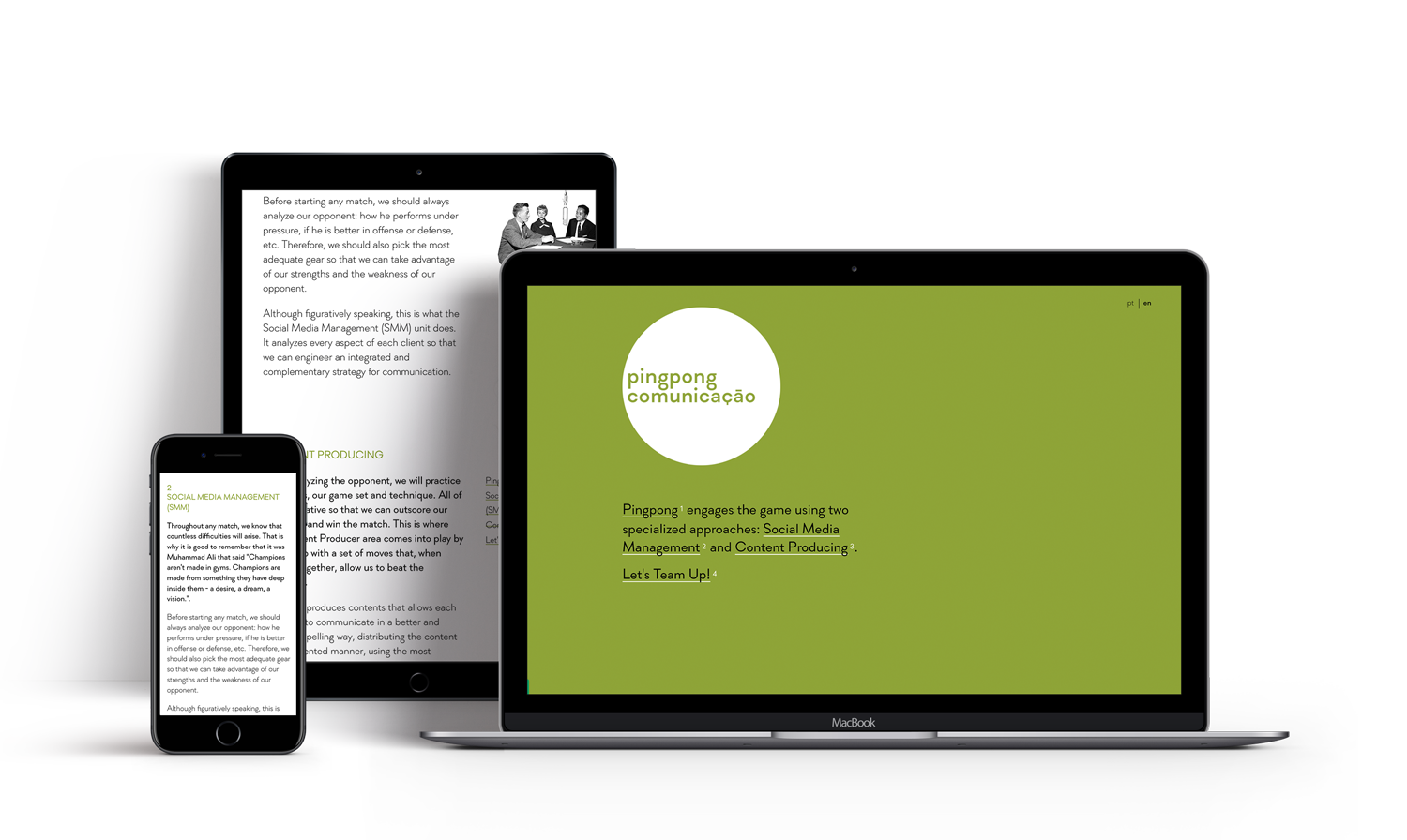
Pingpong Comunicação is a content strategy duo based in Matosinhos, Portugal.
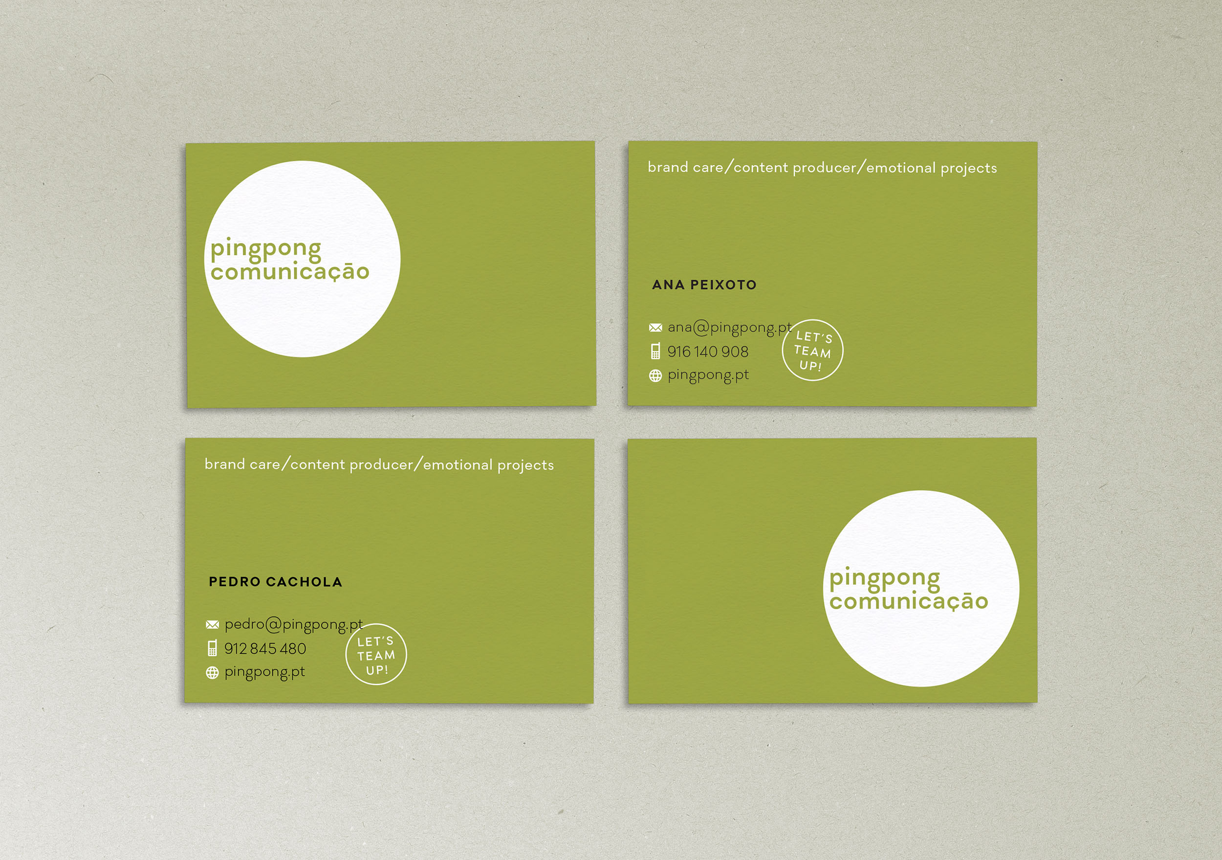
Ana and Pedro asked us to create a friendly and memorable logo, as well as the basic stationery. We defined a warm, light olive green as the corporate color and chose Soin Sans as their typeface. For the logo, we adapted the typeface characters “ç” and “ã” to stand out less from the rest.
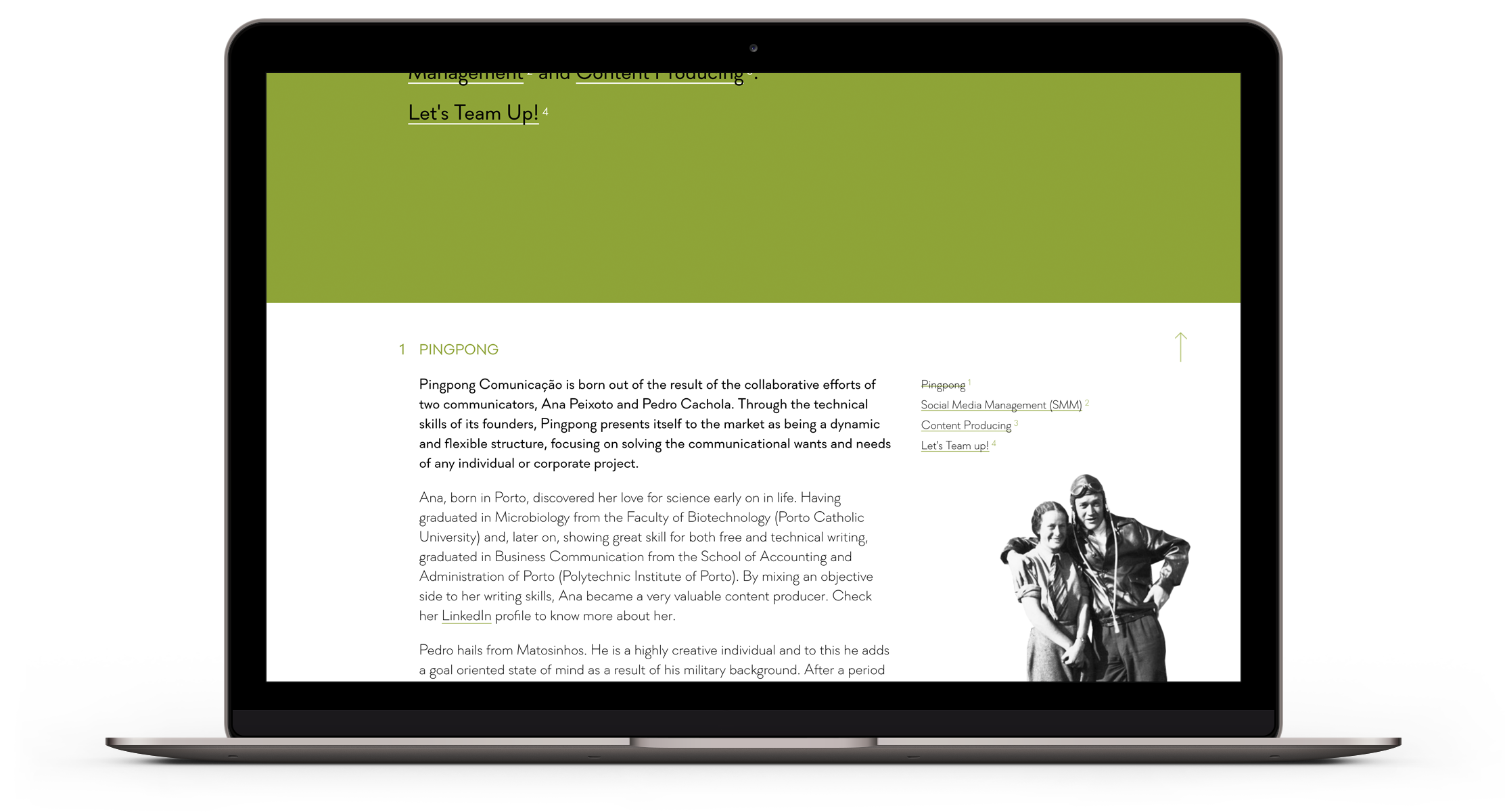
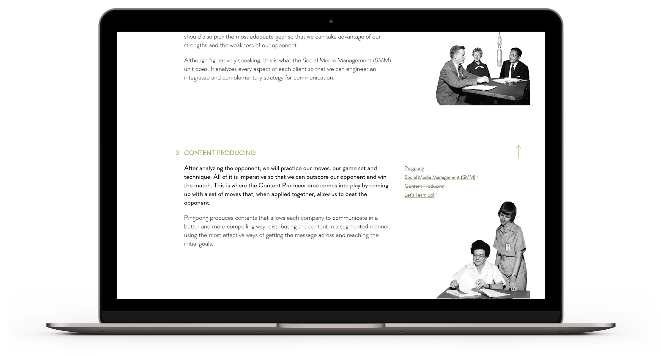
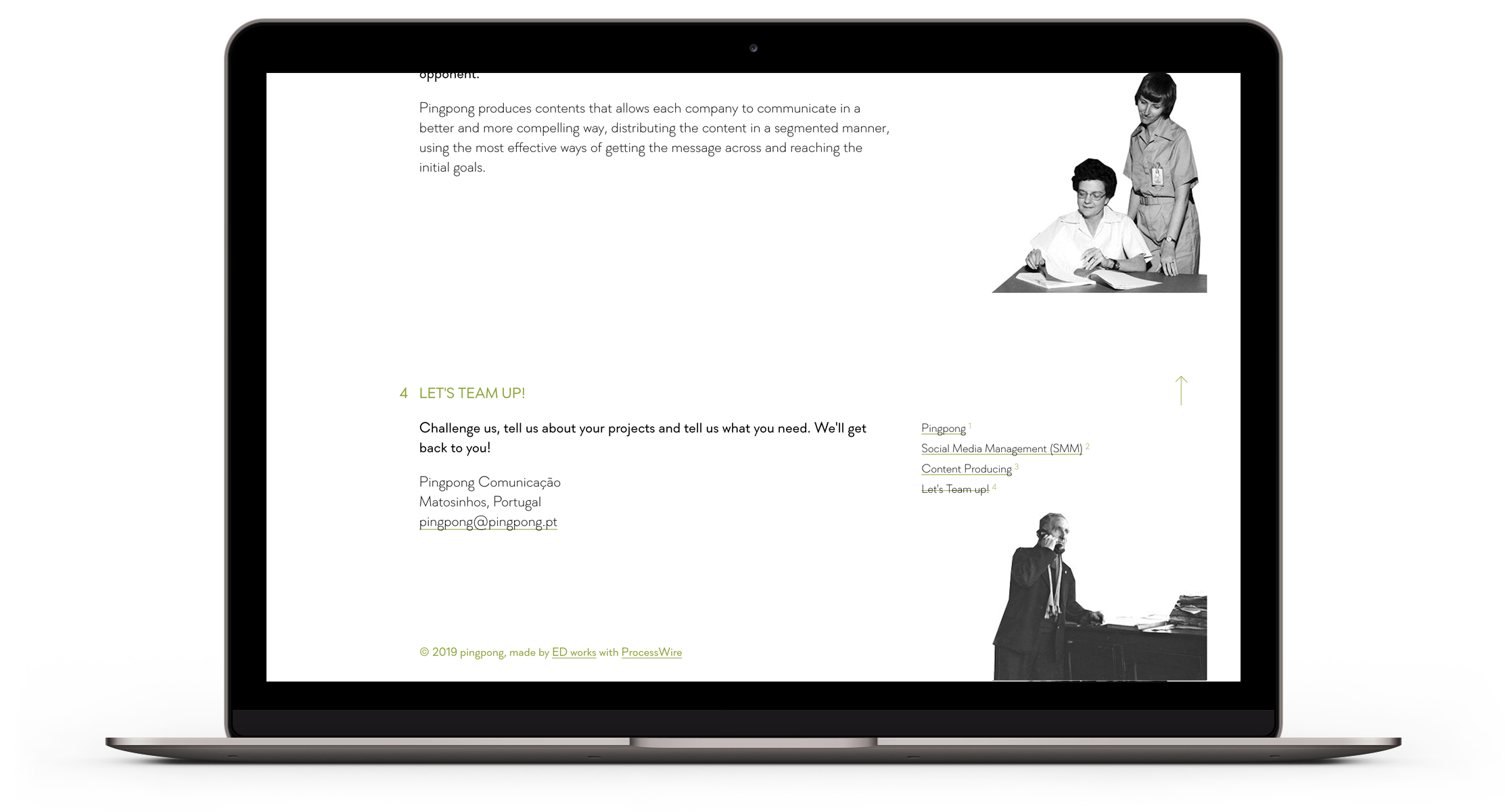
On the website, all the content is displayed in only one page. The introduction sentence serves also as the main menu and the navigation is made easy by displaying the menu items next to each block of content. We chose old b/w public domain images to give a sense of irony and contrast not only with the modern look of the site but also with the variety of contemporary communication media and devices. The color is sparse, we wanted to give focus to their corporate green.